Fintech · Case study
Faysal Digibank: Banking app UX redesign
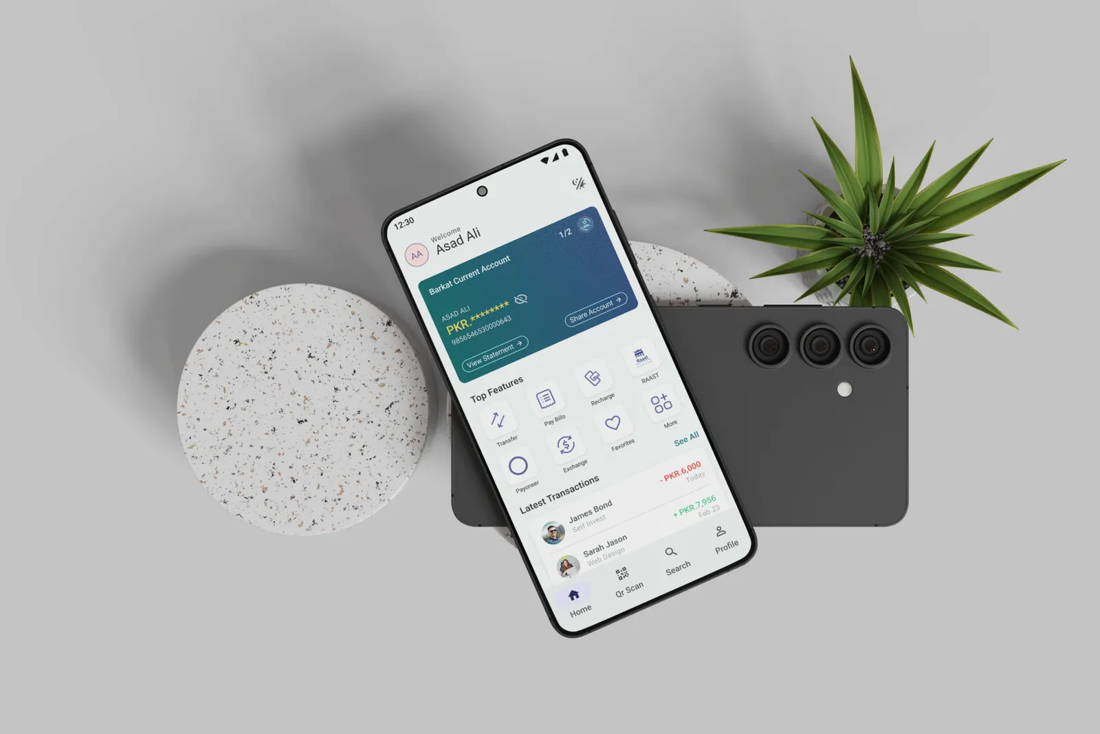
A self-initiated UX case study that turns a complex banking app into a modern, user-centred experience, from research to tested high-fidelity UI.
80+
High-fidelity screens designed
3 months
Research to tested UI
Biometric
Login replaces repeated OTP prompts
The problem
Complex navigation and repeated OTPs
UX research and competitive analysis showed the app was visually outdated and hard to navigate. Users struggled to find essential features. Missing basics like Dark Mode, Global Search and Account Sharing, plus repeated OTP prompts, made everyday banking frustrating.
The solution
80+ screens built on Material Design
I ran an end-to-end process, from user research to high-fidelity UI. On a Material Design system, I designed 80+ screens that streamline the main flows and replace repeated OTPs with biometric authentication.
I added Dark Mode and Advanced Search, then validated the new architecture with usability testing.
Key learnings
Speed beats new features
Usability over aesthetics
In banking, simplifying complex data matters far more than making it look good.
Validating with data
Usability studies showed people do not want more features. They want speed, search and frictionless transactions.
The impact
A faster, more trustworthy banking journey
The case study turns a cluttered app into a functional, accessible experience. Grounded in real research and testing, the new architecture sets a clear standard for frictionless, trustworthy digital banking.
Want the full story behind Faysal Digibank?
I’m happy to walk you through the research, the trade-offs and the screens on a quick call.